Connect with us

Technology

Xiaomi Redmi Note 12 review, price and specifications

Published

on

Redmi Note 12

Xiaomi Redmi Note 12 review, price and specifications

Redmi Note 12
Xiaomi Redmi Note 12 review. Checking the camera, hardware, software, battery, design, screen and charging speed of Redmi Note 12.

Xiaomi Redmi Note 12 review, price and specifications

Introduction

Considering that the 4G version of the most affordable Redmi Note 12 hasn’t been released this year, it’s time to know about the 5G changes as well. The point here is that Redmi Note 12 4G and Note 12 5G use different hardware, so the user experience may be slightly different. 

The most obvious difference is in the chipsets. The 4G has a Snapdragon 685 processor, while the 5G option has a 1st generation Snapdragon 4 chip. And contrary to our expectations, the latter looks more powerful in every way as the original Redmi Note 12 with 5G capability costs almost 100 euros more.

Xiaomi Redmi Note 12 specs review at a glance
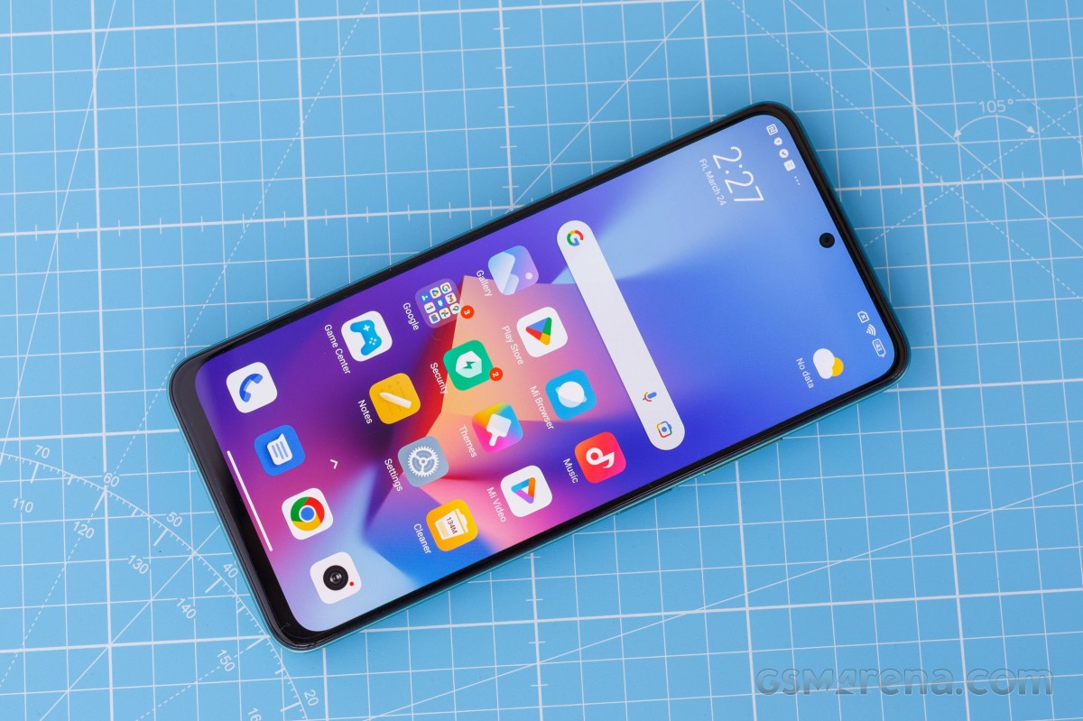
Body: 165.9×76.2×8.0mm, 188g; Gorilla Glass 3 front, plastic back and frame; IP53, resistant to dust and water splash.
Screen: 6.67 inches AMOLED, 120 Hz, 1200 nits (peak), resolution 1080 x 2400 pixels, aspect ratio 20:9, 395ppi.
Chipset: Qualcomm SM4375 Snapdragon 4 Gen 1 (6nm): Octa-core (2×2.0 GHz Cortex-A78 & 6×1.8 GHz Cortex-A55); Adreno 619.
Memory: 128GB 4GB RAM, 128GB 6GB RAM, 256GB 8GB RAM; UFS 2.2; microSDXC (uses a shared SIM card slot).
OS/Software: Android 12, MIUI 14 
Rear camera: Wide (main): 48 MP, f/1.8, PDAF; Ultra Wide Angle: 8MP, f/2.2, 120˚, 1/4″ 1.12µm; Macro: 2 MP, f/2.4.
Front camera: 13 MP, f/2.5, (wide), 1/3.0 inch
Video recording: rear camera: 1080p@30fps; Front camera: 1080p@30fps.
Battery: 5000 mAh; 33W wired, 50% in 22 minutes (advertised).
Other features: Fingerprint reader (mounted on the side). infrared port; 3.5 mm jack
The 5G version also has a 48MP primary camera instead of 50MP, offering 128GB of base storage. Otherwise, with the 4G model, it uses the same 120 Hz OLED panel, 33 W fast charging, 5000 mAh battery, and the triple combination – FM radio, dedicated microSD card slot and 3.5 mm audio jack – features. Considered a mid-range phone .
Xiaomi Redmi Note 12 review
 We suggest you continue reading on the following pages to find out how the apparently more efficient Snapdragon 4 Gen 1 chipset fares against the Snapdragon 685 in terms of performance and endurance.

Unboxing Xiaomi Redmi Note 12

The device comes in a standard retail box containing all the usual user manuals, a USB-A to USB-C cable for charging and data transfer, as well as a convenient 33W charger.
Redmi Note 12
There’s also a bonus clear silicone protective case in the box to get you started.

Xiaomi Redmi Note 12 design review

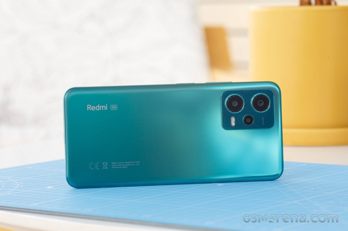
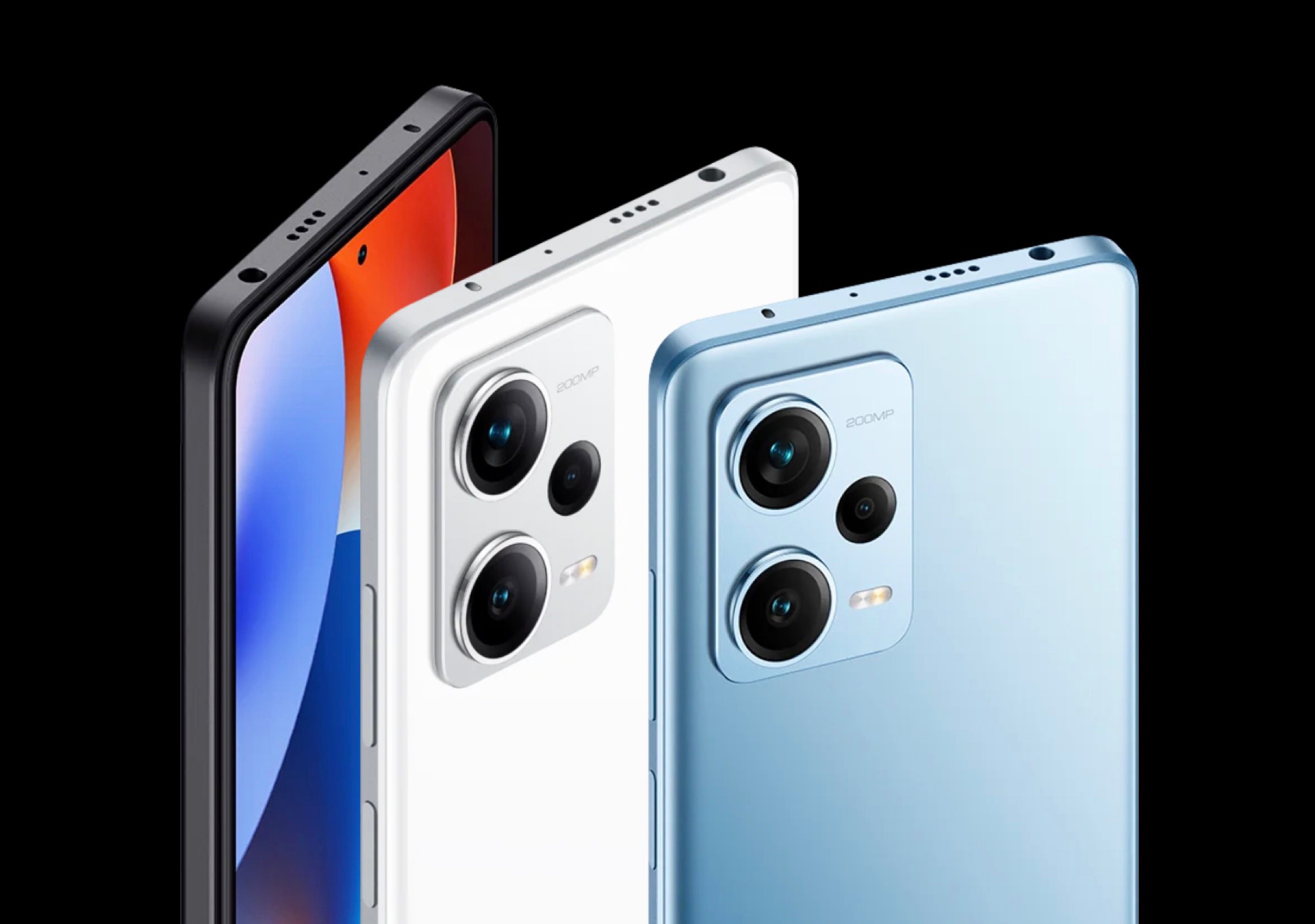
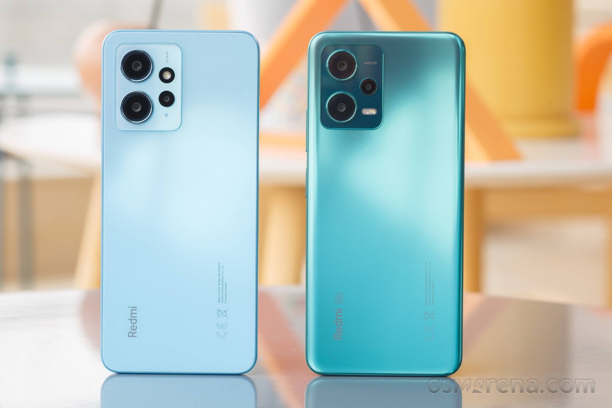
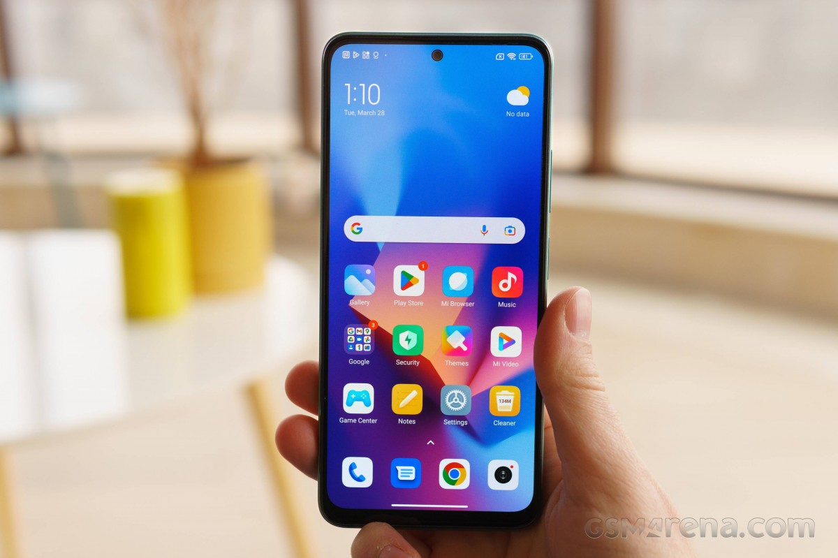
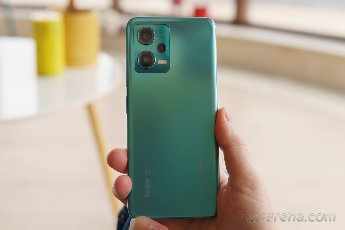
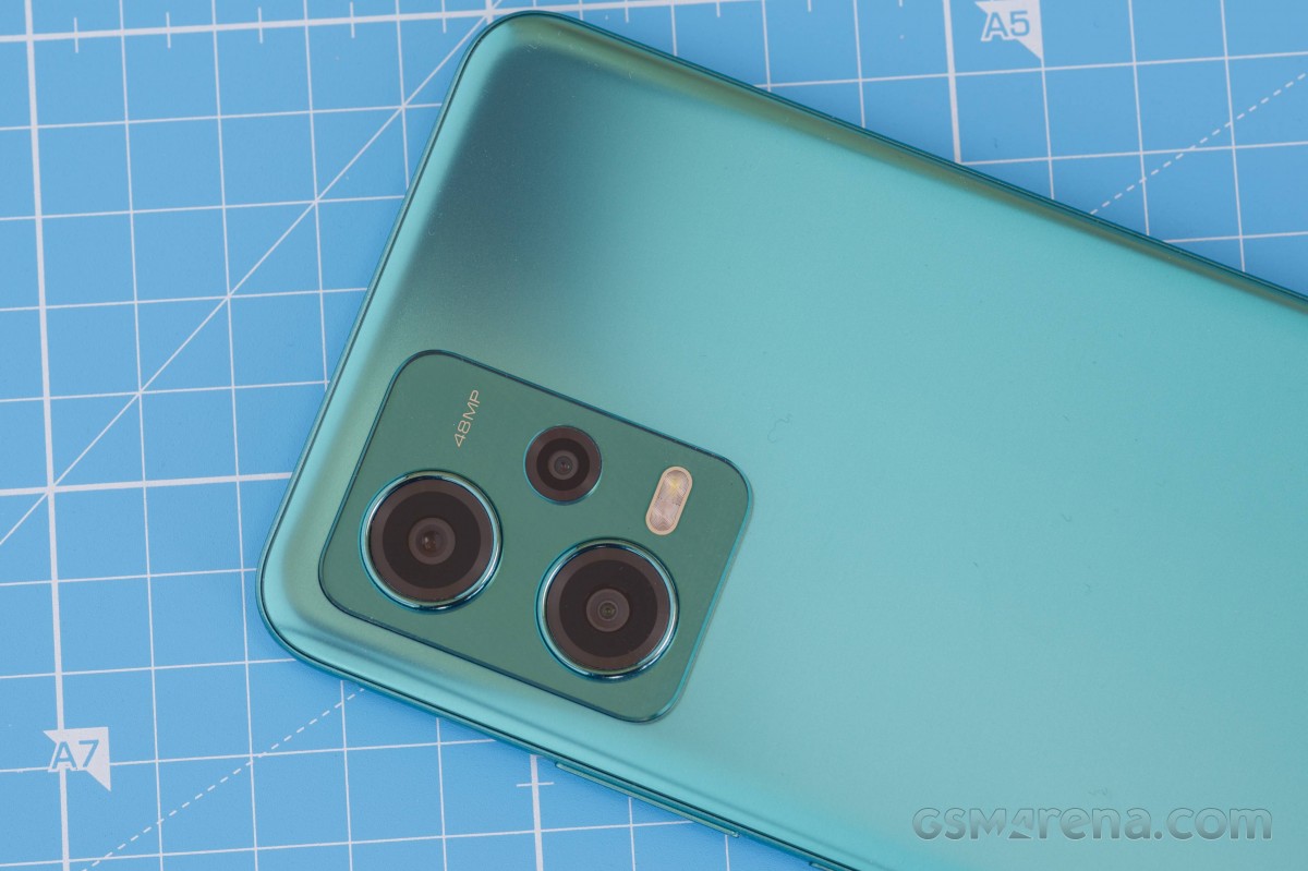
The design of the Redmi Note 12 is slightly different from the 4G option and is more in line with other members of the Redmi Note 12 family. In fact, it’s almost like the pros – the same curves, looks and camera island. The camera bump doesn’t stick out as much and the individual camera rings stick out just a bit.
Xiaomi Redmi Note 12 review

The back of the phone is covered with matte plastic that looks like glass. We have the matte green, but there’s also matte black and Mystique blue. Fingerprints and smudges can be seen at certain angles, but they are far from prominent. They also clear quickly.

The curves of the sides provide a good and comfortable grip without creating unwanted protrusions with the side frame. However, the Redmi Note 12 is slippery due to its matte finish.
Xiaomi Redmi Note 12 review

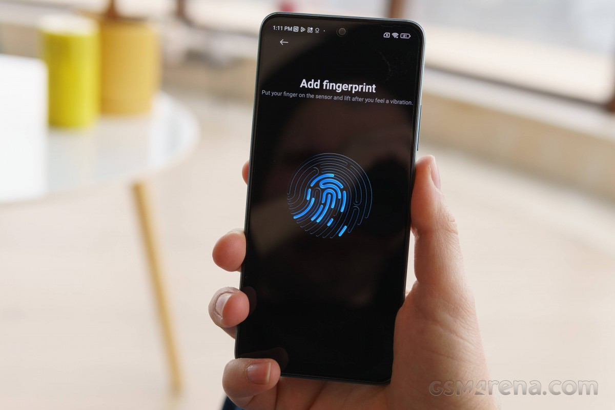
The side frame is also made of plastic with a matte finish. On the right side is the volume button along with the power button, which also acts as a fingerprint sensor.

The power button is just within reach of the thumb, but the volume button requires a stretch.  It is difficult to distinguish between these two buttons. They are almost identical to touch and sometimes you can hit by mistake.
Xiaomi Redmi Note 12 review

The left side only houses the SIM/microSD card tray, and at the bottom, we see the USB-C connector and the speaker grill. The 3.5mm audio jack is placed on the top of the frame to accompany the IR blaster.
Xiaomi Redmi Note 12 - Xiaomi Redmi Note 12 review Xiaomi Redmi Note 12 - Xiaomi Redmi Note 12 review

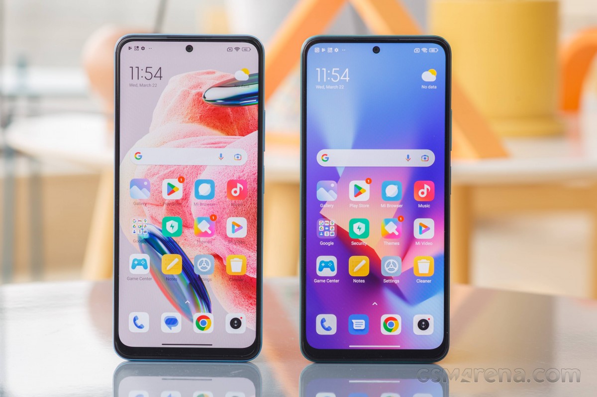
The front is quite similar to the 4G version, which is not surprising given that the two devices share the same panel. The top and side bezels are relatively thin, but the bottom chin is quite thick. This usually applies to cheap phones. At least the selfie camera notch is very small.
Xiaomi Redmi Note 12 review
And even though the front panel is completely flat, the sides aren’t sharp and don’t create an awkward gap or bulge where it meets the side bezel.
Xiaomi Redmi Note 12 - Xiaomi Redmi Note 12 review Xiaomi Redmi Note 12 - Xiaomi Redmi Note 12 review
Overall, in terms of design, the Redmi Note 12 is decent. It’s quite lightweight, weighing in at 188 grams, which isn’t too shabby for a 6.67-inch smartphone. Maybe it’s a bit heavier, which gives the impression of a heavier phone. The IP53 certification against dust and splashes is also a nice bonus in the sub-€300 price segment.

Xiaomi Redmi Note 12 screen review

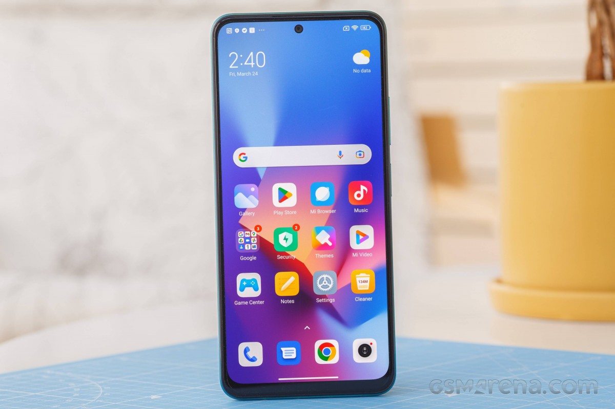
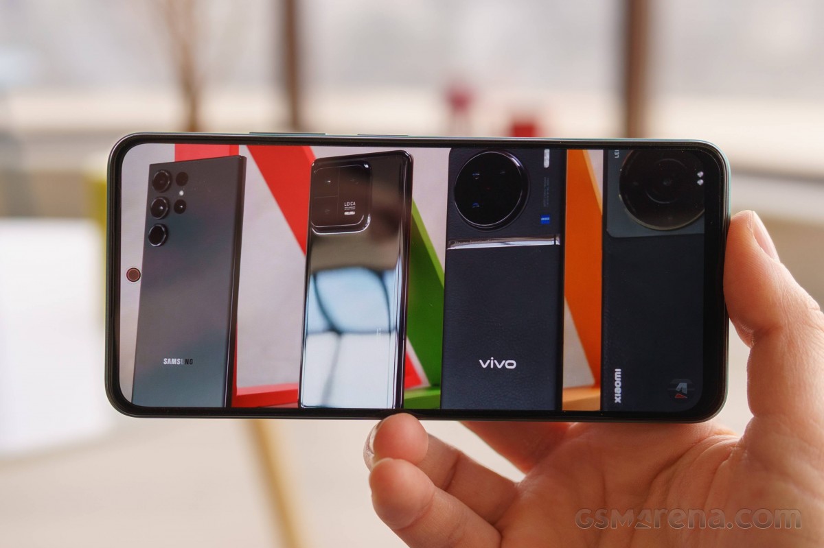
Both Redmi Note 12 4G and Redmi Note 12 5G have the same display panel – AMOLED, 1080 x 2400 pixels resolution, 6.67 inches diagonal and 120 Hz refresh rate. There’s no HDR video capability, but we didn’t expect that.
Xiaomi Redmi Note 12 review

And since the two phones share the same panel, our test results were identical for all intents and purposes.
In manual mode, we got a maximum brightness of 447 nits, while in auto mode, the panel maxed out at 706 nits. These are close to our 474 and 744 nits respectively on the 4G version. Don’t mind the difference of 30-40 nits. This is a fairly standard deviation in different units and is hardly noticeable.
In short, with the Redmi Note 12, you get a bright enough OLED display that offers excellent readability in sunlight.
Redmi Note 12
When it comes to color reproduction, we got the best results in the so-called standard color mode. The dE2000 we measured against the sRGB color space was 1.4, which is impressive – this is a color-calibrated display if we’ve ever seen one.

HRR control

High refresh rate control is very simple. It is actually very simple. The software doesn’t drop down to 60Hz when the on-screen interface is disabled, and it only does so when you launch a video player like YouTube, Netflix, or the Gallery app. In all other scenarios, you will have a constant 120Hz. This approach increases overall power consumption, but it’s not noticeable – the Galaxy A34 we recently reviewed behaved in much the same way.

 Battery Life

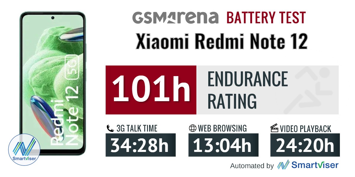
The Redmi Note 12 relies on the same 5,000 mAh battery as its 4G counterpart, but also uses a different chipset that is said to be more efficient. And judging by the on-screen tests, it’s somewhat better in the web browsing scenario, but it didn’t last as long in the video playback test.
Xiaomi Redmi Note 12 review
Either way, we’re happy with the screen-on runtime, but the phone gets a 101-hour endurance rating due to its poor standby time. This is a small amount for a cheap smartphone with a large battery.
This seems to be a common issue across the entire Redmi Note 12 lineup. Standby power consumption seems to be higher than normal for all of them.
Redmi Note 12

 Charging speed

Both Redmi Note 12 phones have the same battery and charging standard. We doubt that chipsets make a difference in the equation, and the results bear this out. The 5,000 mAh battery is fully charged in one hour and eight minutes using a 33W charger, while you’ll see 56 percent charge in 30 minutes. The difference between charging times on both devices is very small and can easily be explained by statistical error.

Compared to competing solutions, the Redmi Note 12 performs well. The supported 33W fast charging is very suitable for the price category.

Redmi Note 12

Redmi Note 12

 Speakers

This year, the vanilla Redmi Note has given up the speaker setup and relies only on the bottom speaker. This is a bit disappointing as the Redmi Note 11 offered a stereo setup from last year.

In any case, the loudness is not amazing, but it is “good” enough at -28.1 LUFS. You should not expect much in terms of quality. The bass is dull and the high frequency sounds start ringing at a higher volume.

And while there weren’t many alternatives to the Redmi Note 12 4G with stereo speakers, many of the Redmi Note 12 5G’s competitors have stereo speakers.

Redmi Note 12

 Performance and Software

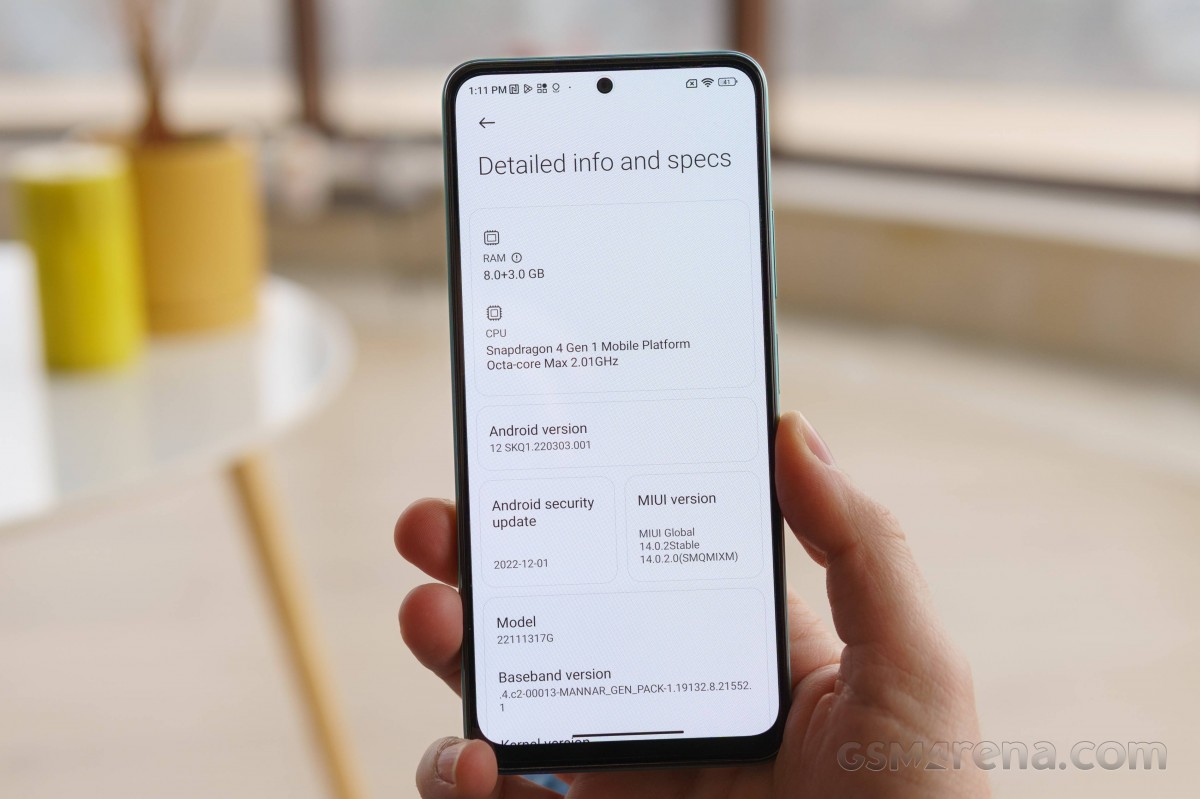
Surprisingly, the Redmi Note 12 5G will receive an older Android 12 at launch. , remember it. Feature-wise, this shouldn’t be a problem as most MIUI phones share the same feature set, barring hardware limitations. That means both devices get essentially the same software, but the 4G iteration has the latest Android 13 as its base. And we prefer to keep the latest version of Android safe for the future, especially since Android 13 has been around for over half a year.
Xiaomi Redmi Note 12 review

MIUI 14 is apparently built almost from scratch as engineers have reworked the original MIUI ROM architecture at the Android kernel level. This includes new CPU, GPU and memory timings, smaller operating system size and overall reduced memory consumption. As a result, Xiaomi claims a 60% smoother experience and more optimized processes. There is also automatic compression for programs that are not actively used. Unfortunately, however, these are not features we can reliably test and verify.
In terms of features, we found some MIUI 14 features advertised. The new enlarged folders are here, and the Gallery app gets native text recognition in addition to Google Lens integration. New large folders are also available on the main page. However, XXL size folders are nowhere to be found, so you can choose between Regular and Enlarged.
Large folders - Xiaomi Redmi Note 12 review Large folders - Xiaomi Redmi Note 12 review
Other features like smart device switching for easier management of Xiaomi smart devices, new widgets and a switch to turn off persistent notifications are nowhere to be found. We are also still waiting for the notification history option which is an Android built-in feature.
The rest is business as usual, and we’ll try to focus on features that are somewhat unique to MIUI or are somehow standout functions.
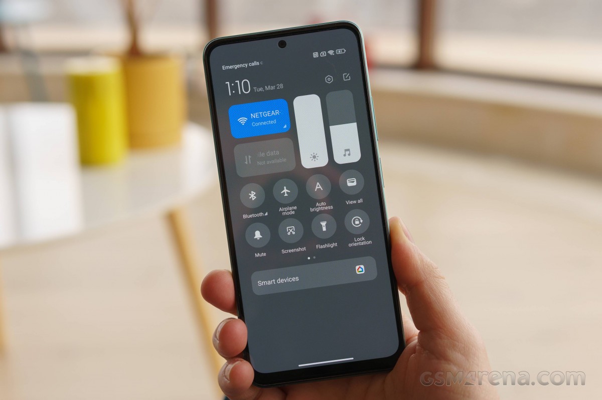
The split between Notifications and Control Center is enabled by default, and that’s probably a good thing. We found this to be very convenient and a way to teach users about MIUI’s unique approach to the user interface. And if you’re not a fan, you can always switch back to standard notifications by swiping in a location.
General settings - Xiaomi Redmi Note 12 review General settings - Xiaomi Redmi Note 12 review General settings - Xiaomi Redmi Note 12 review
Home screen, recent apps and general settings remain unchanged. The app drawer is also enabled by default, and we like that Xiaomi has placed the search bar at the bottom of the screen for easier access. There are custom and preset app categories for faster navigation.
Home screen, recent apps, notification shade, Control center - Xiaomi Redmi Note 12 review Home screen, recent apps, notification shade, Control center - Xiaomi Redmi Note 12 review Home screen, recent apps, notification shade, Control center - Xiaomi Redmi Note 12 review Home screen, recent apps, notification shade, Control center - Xiaomi Redmi Note 12 review
Unlike the standard apps menu of late, the MIUI menu lists apps vertically (you can switch to the standard horizontal orientation) and offers several useful shortcuts. This is where you can open apps in floating windows. However, you can keep a maximum of one application open at a time. If you want a faster shortcut for apps that support open windows, just enable the sidebar.
Sidebar and Floating windows - Xiaomi Redmi Note 12 review Sidebar and Floating windows - Xiaomi Redmi Note 12 review Sidebar and Floating windows - Xiaomi Redmi Note 12 review Sidebar and Floating windows - Xiaomi Redmi Note 12 review
Themes have always been a big part of MIUI and they are available in MIUI 14 as well. You can download new ones from the theme store, and they can change wallpapers, ringtones, system icons, and even the always-on display style.
Themes app and other customizations - Xiaomi Redmi Note 12 review Themes app and other customizations - Xiaomi Redmi Note 12 review Themes app and other customizations - Xiaomi Redmi Note 12 review Themes app and other customizations - Xiaomi Redmi Note 12 review Themes app and other customizations - Xiaomi Redmi Note 12 review
Of course, in addition to the preset settings, there is also an always-on display setting. The Notification effect lights up the edges of the screen when new notifications come in, but there’s no customization other than a few different colors and a Starlight option. This effect can work with or without AOD.
Always-on display options - Xiaomi Redmi Note 12 review Always-on display options - Xiaomi Redmi Note 12 review Always-on display options - Xiaomi Redmi Note 12 review Always-on display options - Xiaomi Redmi Note 12 review Always-on display options - Xiaomi Redmi Note 12 review
Moving towards privacy and security, MIUI comes with a pre-installed system security app. Aside from the extra layer of malware protection it provides, the app keeps many of the app’s settings and privacy features in one place. It can manage your blacklist, manage or limit your data usage, configure battery behavior and free up some RAM. It can also manage the permissions of your installed apps, define the battery behavior of selected apps, and apply restrictions to only certain apps.
Security app - Xiaomi Redmi Note 12 review Security app - Xiaomi Redmi Note 12 review
All in all, MIUI 14 has changed little in terms of overall user experience compared to the 13th iteration, and that’s not a bad thing. Fast and customizable as always.
Xiaomi Redmi Note 12 review
Xiaomi has paid special attention to the touch part of this device and we found that its engine is clear, strong, accurate and responsive. It reacts to many actions throughout the system and during navigation. Even if it is not intrusive or strong enough, there is an intensity of tactile feedback.

Benchmark performance

The Snapdragon 4 Gen 1 was released over half a year ago, but this is our first time playing with it. The adoption rate of some recent Qaulcomm chipsets has been relatively slow. In any case, the Snapdragon 4 Gen 1 is supposed to replace the Snapdragon 400 series chips that offer higher performance and performance. The chip is based on TSMC’s 6nm production node and uses an octa-core CPU.
Xiaomi Redmi Note 12 review
The CPU itself consists of 2 Cortex-A78 cores clocked at 2.0 GHz while the other cores are 6 Cortex-A55 cores clocked at 1.8 GHz. On the other hand, Adreno 619 handles tasks that require graphics processing. This GPU is specifically used in many of the Snapdragon 600 and 700 series chipsets, so it’s welcome at the lower end of Snapdragon.
The device we are reviewing is the flagship version with 8GB of RAM and 128GB of internal storage. Otherwise, this phone will be sold in two models of 4.128 GB and 6.128 GB. Now without further ado, let’s get to the benchmarks.
Redmi Note 12
Redmi Note 12
Redmi Note 12
Unfortunately, we weren’t able to run a full set of benchmarks on the Redmi Note 12 5G as some were limited. However, Geekbench and AnTuTu are sufficient to measure the overall performance of the Snapdragon 4 Gen 1. And besides, we have already tested a lot of Adreno 619 GPUs in our database.
The 1st generation Snapdragon 4 performs well against other chipsets in the same price range. It lags behind the competition in single-threaded workloads but keeps pace in multi-core CPU scenarios. In composite tests, the SoC lags behind the rest. It only beat the Snapdragon 685 in the Redmi Note 12 4G and last year’s Redmi Note 11 with the same Snapdragon 680.
Other phones that use the Snapdragon 695 clearly have more power under the hood. Even Samsung’s Exynos 1280 chip performs better in two of these scenarios. It lags behind the SD4 Gen 1 only in the single-core Geekbench test.

Xiaomi Redmi Note 12 camera review

The camera settings are slightly different from the 4G version of the phone. The primary camera here has been replaced by a 48-megapixel camera paired with an f/1.8 aperture. Apart from the main camera, the rest of the camera hardware is the same in these two phones.
Xiaomi Redmi Note 12 review

We’ve got an 8-megapixel f/2.2, 120-degree, 1/4-inch 1.12μm ultra-wide camera on the back, along with a 2-megapixel f/2.4 macro camera.
For selfies, the Redmi Note 12s uses a 13-megapixel, f/2.5, (wide), 1/3.0-inch screen.

Camera menus

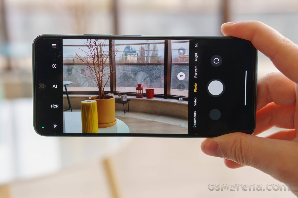
The camera app is a fairly simple implementation, though it has its quirks. First, the main operation works for switching modes using sideswipes, and you can also tap on the modes you see to go directly to them.
Up and down swipes do not work to switch between front and rear cameras. Only the button next to the shutter does this.
You can add, remove, and reset modes in the main rolodex by going to the More tab and clicking the Edit button, and you can also access it from the Settings menu. Unused modes will still be in that More tab, but you’ll be able to switch to a (less visual) pull-out page called up from a line next to the shutter.
Camera modes - Xiaomi Redmi Note 12 review Camera modes - Xiaomi Redmi Note 12 review Camera modes - Xiaomi Redmi Note 12 review Camera modes - Xiaomi Redmi Note 12 review Camera modes - Xiaomi Redmi Note 12 review
The hamburger menu at the bottom is where you’ll find additional options, including macro mode. Next to that hamburger menu, you have a flash mode switch, an HDR switch, an AI key, and a shortcut for Google Lens. We noticed that the HDR switch always turns off after closing the camera app. So be aware of that and always check if the HDR switch is turned on. We recommend keeping it on, even though the software rarely selects HDR mode.
Camera settings - Xiaomi Redmi Note 12 review Camera settings - Xiaomi Redmi Note 12 review
As expected, there are additional modes, including Long Exposure with a selection of different presets – Moving Crowd, Neon Trails, Oil Painting, Light Painting, Starry Sky, and Star Trails.
Night mode is only available on the main camera and in 2x zoom mode.

Photos taken during the day

Main camera

  The Redmi Note 12 takes decent photos as long as the lighting conditions are right. However, it is unrealistic to expect great quality from a phone under 300 euros. However, keep in mind that these photos were taken under a heavily overcast sky, so that may cloud your judgment.
Overall, noise is the most important issue here. There’s a lot of graining around, mostly in shadows and homogenous backgrounds. Also, if you take pictures one after another without waiting a few seconds, each picture after the second one becomes very noisy, indicating that the ISP’s performance may be limited.
Otherwise, we find the photos sufficiently detailed, sharp enough, with natural colors and acceptable dynamic range. However, the contrast is slightly higher than the Xiaomi model. This often produces grainy looking photos and sometimes overly dark shadows.
Daylight main camera samples - f/1.8, ISO 50, 1/787s - Xiaomi Redmi Note 12 review Daylight main camera samples - f/1.8, ISO 50, 1/699s - Xiaomi Redmi Note 12 review Daylight main camera samples - f/1.8, ISO 50, 1/720s - Xiaomi Redmi Note 12 review
Daylight main camera samples - f/1.8, ISO 50, 1/997s - Xiaomi Redmi Note 12 review Daylight main camera samples - f/1.8, ISO 50, 1/809s - Xiaomi Redmi Note 12 review Daylight main camera samples - f/1.8, ISO 50, 1/241s - Xiaomi Redmi Note 12 review
Daylight main camera samples - f/1.8, ISO 50, 1/1205s - Xiaomi Redmi Note 12 review Daylight main camera samples - f/1.8, ISO 90, 1/50s - Xiaomi Redmi Note 12 review Daylight main camera samples - f/1.8, ISO 180, 1/33s - Xiaomi Redmi Note 12 review
Compared to the Note 12 4G’s cameras, the 5G’s camera is an overall better camera. The 4G version produces noisier and darker photos with sharper contrast. Colors are also nicer in 5G iterations.
Daylight samples: Note 12 4G - f/1.8, ISO 50, 1/760s - Xiaomi Redmi Note 12 review Daylight samples: Note 12 5G - f/1.8, ISO 50, 1/640s - Xiaomi Redmi Note 12 review Daylight samples: Note 12 4G - f/1.8, ISO 50, 1/656s - Xiaomi Redmi Note 12 review Daylight samples: Note 12 5G - f/1.8, ISO 50, 1/649s - Xiaomi Redmi Note 12 review
Daylight samples: Note 12 4G - f/1.8, ISO 50, 1/609s - Xiaomi Redmi Note 12 review Daylight samples: Note 12 5G - f/1.8, ISO 50, 1/669s - Xiaomi Redmi Note 12 review Daylight samples: Note 12 4G - f/1.8, ISO 50, 1/749s - Xiaomi Redmi Note 12 review Daylight samples: Note 12 5G - f/1.8, ISO 50, 1/763s - Xiaomi Redmi Note 12 review
Daylight samples: Note 12 4G - f/1.8, ISO 50, 1/609s - Xiaomi Redmi Note 12 review Daylight samples: Note 12 5G - f/1.8, ISO 50, 1/498s - Xiaomi Redmi Note 12 review Daylight samples: Note 12 4G - f/1.8, ISO 172, 1/50s - Xiaomi Redmi Note 12 review Daylight samples: Note 12 5G - f/1.8, ISO 90, 1/50s - Xiaomi Redmi Note 12 review
Daylight samples: Note 12 4G - f/1.8, ISO 169, 1/33s - Xiaomi Redmi Note 12 review Daylight samples: Note 12 5G - f/1.8, ISO 180, 1/33s - Xiaomi Redmi Note 12 review

Double zoom

This mode has the same features as the standard 1x mode and overall processing, but noise is more obvious, everything is noticeably smoother, and you can see jagged straight lines from a distance. The upgrade to 12MP is pretty obvious.

Daylight 2x zoom samples - f/1.8, ISO 50, 1/753s - Xiaomi Redmi Note 12 review Daylight 2x zoom samples - f/1.8, ISO 50, 1/483s - Xiaomi Redmi Note 12 review
Daylight 2x zoom samples - f/1.8, ISO 50, 1/1139s - Xiaomi Redmi Note 12 review Daylight 2x zoom samples - f/1.8, ISO 50, 1/835s - Xiaomi Redmi Note 12 review

Ultra wide camera

As is often the case, ultra-wide cameras produce less-than-optimal photos in the low-end and mid-range categories. No matter the lighting conditions, noise abounds, sharpness is lacking, and fine detail is completely lost. Xiaomi has boosted the contrast and colors for a more attractive look and to some effect.

Daylight ultrawide samples - f/2.2, ISO 60, 1/2342s - Xiaomi Redmi Note 12 review Daylight ultrawide samples - f/2.2, ISO 50, 1/2349s - Xiaomi Redmi Note 12 review Daylight ultrawide samples - f/2.2, ISO 50, 1/2683s - Xiaomi Redmi Note 12 review
Daylight ultrawide samples - f/2.2, ISO 50, 1/1827s - Xiaomi Redmi Note 12 review Daylight ultrawide samples - f/2.2, ISO 60, 1/3508s - Xiaomi Redmi Note 12 review

Macro camera

The macro camera uses a small 2MP sensor with fixed focus, so getting decent macro shots is a challenge. Not enough detail, although resolution is good. The lack of contrast and vivid colors makes it really hard for us to recommend using a macro camera.

Macro camera samples - Xiaomi Redmi Note 12 review Macro camera samples - Xiaomi Redmi Note 12 review

Photos taken at night

Main camera

As was the case with the 4G version, the main camera of the 5G variant also struggles to deliver good photo quality in low light. Dynamic range isn’t ideal as we can see crushed shadows, there’s noise all around, and photos tend to be soft and lacking in detail. However, we found that the 5G version produced better colors, the contrast was significantly higher and the highlights looked better.

Low-light main camera samples - f/1.8, ISO 480, 1/17s - Xiaomi Redmi Note 12 review Low-light main camera samples - f/1.8, ISO 3400, 1/14s - Xiaomi Redmi Note 12 review Low-light main camera samples - f/1.8, ISO 1700, 1/14s - Xiaomi Redmi Note 12 review
Low-light main camera samples - f/1.8, ISO 470, 1/20s - Xiaomi Redmi Note 12 review Low-light main camera samples - f/1.8, ISO 1900, 1/17s - Xiaomi Redmi Note 12 review Low-light main camera samples - f/1.8, ISO 1030, 1/17s - Xiaomi Redmi Note 12 review

A dedicated night mode is a hit or miss. In an attempt to remove noise, the algorithm smears out what remains of detail in the photo. In fact, in some cases, with night mode on, the night sky looks very grainy. The only benefit of using night mode is that it raises the shadows and introduces more detail there.
Night mode main camera samples - f/1.8, ISO 490, 1/20s - Xiaomi Redmi Note 12 review Night mode main camera samples - f/1.8, ISO 3700, 1/17s - Xiaomi Redmi Note 12 review Night mode main camera samples - f/1.8, ISO 1800, 1/17s - Xiaomi Redmi Note 12 review
Night mode main camera samples - f/1.8, ISO 410, 1/20s - Xiaomi Redmi Note 12 review Night mode main camera samples - f/1.8, ISO 1700, 1/17s - Xiaomi Redmi Note 12 review Night mode main camera samples - f/1.8, ISO 950, 1/17s - Xiaomi Redmi Note 12 review
When it comes to low-light performance, both devices are quite comparable. The only noticeable difference is in colors and contrast. The same goes for night mode photos.
Low-light: Note 12 4G - f/1.8, ISO 12800, 1/15s - Xiaomi Redmi Note 12 review Low-light: Note 12 5G - f/1.8, ISO 9700, 1/14s - Xiaomi Redmi Note 12 review Low-light: Note 12 4G - f/1.8, ISO 613, 1/17s - Xiaomi Redmi Note 12 review Low-light: Note 12 5G - f/1.8, ISO 480, 1/17s - Xiaomi Redmi Note 12 review
Low-light: Note 12 4G - f/1.8, ISO 2056, 1/17s - Xiaomi Redmi Note 12 review Low-light: Note 12 5G - f/1.8, ISO 3400, 1/14s - Xiaomi Redmi Note 12 review Low-light: Note 12 4G - f/1.8, ISO 2956, 1/17s - Xiaomi Redmi Note 12 review Low-light: Note 12 5G - f/1.8, ISO 1700, 1/14s - Xiaomi Redmi Note 12 review
Low-light: Note 12 4G - f/1.8, ISO 3296, 1/17s - Xiaomi Redmi Note 12 review Low-light: Note 12 5G - f/1.8, ISO 1900, 1/17s - Xiaomi Redmi Note 12 review
Night mode: Note 12 4G - f/1.8, ISO 10784, 1/8s - Xiaomi Redmi Note 12 review Night mode: Note 12 5G - f/1.8, ISO 8300, 1/13s - Xiaomi Redmi Note 12 review Night mode: Note 12 4G - f/1.8, ISO 613, 1/17s - Xiaomi Redmi Note 12 review Night mode: Note 12 5G - f/1.8, ISO 490, 1/20s - Xiaomi Redmi Note 12 review
Night mode: Note 12 4G - f/1.8, ISO 1969, 1/17s - Xiaomi Redmi Note 12 review Night mode: Note 12 5G - f/1.8, ISO 3700, 1/17s - Xiaomi Redmi Note 12 review Night mode: Note 12 4G - f/1.8, ISO 2267, 1/14s - Xiaomi Redmi Note 12 review Night mode: Note 12 5G - f/1.8, ISO 1800, 1/17s - Xiaomi Redmi Note 12 review
Night mode: Note 12 4G - f/1.8, ISO 2267, 1/14s - Xiaomi Redmi Note 12 review Night mode: Note 12 5G - f/1.8, ISO 1700, 1/17s - Xiaomi Redmi Note 12 review

Double zoom

Not much to say about the 2x zoom examples. This mode is unusable with or without night mode. All the problems we found with the 1x zoom mode are amplified here.

Low-light 2x zoom: Normal - f/1.8, ISO 450, 1/20s - Xiaomi Redmi Note 12 review Low-light 2x zoom: Night mode - f/1.8, ISO 420, 1/20s - Xiaomi Redmi Note 12 review Low-light 2x zoom: Night mode - f/1.8, ISO 1800, 1/14s - Xiaomi Redmi Note 12 review
Low-light 2x zoom: Night mode - f/1.8, ISO 1900, 1/17s - Xiaomi Redmi Note 12 review Low-light 2x zoom: Night mode - f/1.8, ISO 1700, 1/17s - Xiaomi Redmi Note 12 review Low-light 2x zoom: Night mode - f/1.8, ISO 1500, 1/17s - Xiaomi Redmi Note 12 review

Ultra wide camera

With a weak ultra-wide camera during the day, it’s unrealistic to expect good low-light photography. They are very soft, noisy, with washed out colors and poor dynamic range.
Low-light ultrawide samples - f/2.2, ISO 890, 1/17s - Xiaomi Redmi Note 12 review Low-light ultrawide samples - f/2.2, ISO 3200, 1/14s - Xiaomi Redmi Note 12 review Low-light ultrawide samples - f/2.2, ISO 1500, 1/17s - Xiaomi Redmi Note 12 review
Here’s how the main camera on the Xiaomi Redmi Note 12 stacks up against the rest of the competition in the controlled environment of our photo comparison tool.
Photo Compare Tool Photo Compare Tool Photo Compare Tool

portrait mode

The portraits were very solid. Edge detection makes the bokeh effect quite convincing even with a more complex background or foreground, and as long as there’s plenty of light, you can expect sharp, noise-free images with sharp colors and somewhat natural skin tones. However, the slightest drop in ambient light causes noise and sometimes blurs the photos.
Portraits - f/1.8, ISO 90, 1/100s - Xiaomi Redmi Note 12 review Portraits - f/1.8, ISO 50, 1/1226s - Xiaomi Redmi Note 12 review Portraits - f/1.8, ISO 50, 1/799s - Xiaomi Redmi Note 12 review
Portraits - f/1.8, ISO 250, 1/50s - Xiaomi Redmi Note 12 review Portraits - f/1.8, ISO 290, 1/33s - Xiaomi Redmi Note 12 review

selfie camera

The selfie camera needs a bit more stability. If you can hold your hand steady enough and have good ambient light conditions, you can expect decent photos with good clarity and detail. But more than half of the samples we shot were unacceptably blurry, and the ones shot in average room light are downright soft. The colors are also a little dark.
Selfies - f/2.5, ISO 50, 1/100s - Xiaomi Redmi Note 12 review Selfies - f/2.5, ISO 250, 1/33s - Xiaomi Redmi Note 12 review Selfies - f/2.5, ISO 50, 1/1073s - Xiaomi Redmi Note 12 review

Filming

 Video recording capabilities are minimal, but good for the price.  Redmi Note 12 5G supports video recording up to 1080p@30fps and EIS is always on, never turn it off.
Recording with the main camera guarantees decent results. The video is a bit soft even for Full HD resolution, but it has decent contrast, nice colors, and even with heavy cloud cover, the software managed to successfully balance shadows and highlights.
Ultrawide’s ability to record video is very limited. It is very foggy and noisy. There are no fine details and the colors are washed out. Hard to recommend even in good light.
Video Compare Tool Video Compare Tool Video Compare Tool

Review of the competitors of Xiaomi Redmi Note 12
The Xiaomi Redmi Note 12 comes with a decent price tag, which is what you’d expect from last year’s Redmi Note 11 series. In fact, this phone can be found in the mid-200-euro range, making it a more desirable option. And what’s not to like? It has a great 6.67-inch 120Hz OLED panel, a new Snapdragon 4 Gen 1 chipset, a large battery with respectable fast charging, and the holy trinity of features – a 3.5mm audio jack, a dedicated microSD card slot, and a radio. It is FM. A very popular set of features in low to mid range smartphones. And although it depends on the market, NFC appears to be present on our international unit, which was not the case with the 4G version.
Xiaomi Redmi Note 12 review
When it comes to competition, the Redmi Note 12 has plenty of competition. Most of them are last year’s models, but that shouldn’t be too much of a concern since the 2022-2023 timeframe didn’t see a huge leap in silicon technology or anything hardware-related. So with 2022 mid-range phones dropping in price, they will certainly do the trick.

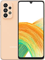
The Samsung Galaxy A33 with a price of 260 euros is a good example. Its panel may not run at 120Hz, but it’s still very strong in terms of quality and overall brightness. The Exynos 1280 is significantly faster than the low-end Snapdragon 4 Gen 1. It has comparable battery life and a set of stereo speakers. The Samsung competitor is also IP67 certified against water, dust and offers a relatively better all-around camera experience and the ability to record 4K videos.

We also like the fact that the A33 has its own under-display fingerprint sensor, which is more convenient and versatile than a side-mounted device.
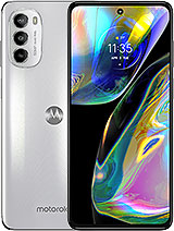
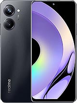
Samsung Galaxy A33 5G Motorola Moto G82 Realme 10 Pro
Alternatively, you can always opt for the 4G version, which offers almost the same user experience. The chipset may not be as fast as SD4 Gen 1, but it runs on newer Android and offers better battery life.

Summary

Just like its 4G counterpart, the Redmi Note 12 5G is a solid all-rounder with no complaints. The phone has a great OLED panel, decent battery life, although we expected more from it, like competitive fast charging, a reliable main camera, and a dedicated microSD card slot.
Xiaomi Redmi Note 12 review
However, with a cheaper 4G version with an almost identical user experience on one side and some strong alternatives with the same price tag, the Redmi Note 12 is in a tough spot this year. The omission of the stereo speakers from last year is a mistake, and the battery life is also outstanding. Once the price comes down a bit, the Note 12 might become more compelling. But for now, consider some of the options we mentioned above.

Why should we buy Xiaomi Redmi Note 12?

  • Comfortable design, IP53 rated.
  • Exceptional and bright 120 Hz OLED screen.
  • Suitable charging speed , 3.5 mm jack, FM radio, IR blaster, microSD slot.
  • The main camera performance is decent if not impressive.

Why should we not buy the Xiaomi Redmi Note 12 phone?

  • Disappointing ultra-wide cameras and selfies, no 4K video recording at all.
  • Without stereo speakers, there are phones with better chipsets for the same price.

Source: GSMARENA.COM

Continue Reading
Advertisement
Click to comment

Leave a Reply

Your email address will not be published. Required fields are marked *

Technology

7 Windows problems that may lead users to MacOS or Linux

Published

on

By

Windows
There are seemingly simple but effective reasons why users prefer MacOS or Linux over Windows; But what are these problems?

7 Windows problems that may lead users to MacOS or Linux

There are many users who have used different versions of Windows for many years and have been satisfied with most of the features of these versions; But according to some of them, there are annoying features in Windows 11 that, if not fixed, may discourage some of them from Windows and lead them to other operating systems such as Linux or MacOS. For example, it took several years for the Control Panel to finally be moved to the System Settings section, but this is not as annoying as other Windows problems that we will mention below.

Display annoying ads

We can almost say that Microsoft has a monopoly on the desktop operating system market. According to Statista , about 72% of personal computers will be using one of Microsoft’s Windows versions by February 2024; It’s just after a decade of decline in the number of Windows users due to the increasing popularity of macOS, so that in 2013 Windows had nearly 91% of the market share.

Microsoft uses the interest of Windows users to display ads for its other products

Unfortunately, Microsoft uses its dominant position in the operating system market to display annoying ads; Such as advertisements that are displayed in the start menu, lock screen and even when upgrading the operating system for users. Some users believe that Microsoft’s ads in Windows are not only annoying in terms of user experience, but can even be considered a form of exclusive behavior.

Microsoft’s exclusive behavior for advertising its other products in Windows is similar to what the company did in 1998 and was questioned by the US Department of Justice. At that time, Microsoft made Internet Explorer the default browser for Windows; While several other companies were competing with each other in the browser market.

Microsoft ads in Windows 11

Of course, Apple, like Microsoft, places its product ads in Safari; But the low market share of this browser has caused Apple’s exclusive behavior to have little effect on the operating system market. On the other hand, Google Chrome still maintains its popularity among users due to its features and high quality and remains the winner of the browser competition.

Get rid of ads in Windows 11 with these methods

To summarize; Microsoft can also advertise its products like other companies; But due to its exclusive position, it places these ads directly in the Windows operating system, and according to users, this is unfair and illegal.

Forced to search in the cloud

Many Windows users prefer to use the Start menu search tool to find their programs, files or games instead of pinning; sometimes when searching for a program or file, ads and purchase offers and links to previous Bing searches are also displayed for users; Some have even stated that these ads caused them to be unable to find the program they had previously installed in some cases. Even Windows ME with all its instability and bugs was better than Windows 11 at least in terms of internal search!

Force search in the cloud in Windows 11

Fortunately, there is a way to disable ads and suggested links in Windows 11 Search; But for this you need to use the registry editor tool and many people can’t disable it without using the guide.

Add new buttons to taskbar

Windows has a habit of placing application icons in the taskbar when it introduces a new feature; Like the new icon of widgets and copilot. The only problem some users have with this theme is that the new icons are displayed by default and they have to go through an extra step to remove them.

Adding new buttons to the taskbar in Windows 11

The mandatory presence of new application icons in the Taskbar is not pleasant for some users

Forcing new features on users is a common theme in the tech world. These conditions make some users feel that even if they pay for the license, they do not own their Windows, and Microsoft still owns the operating system.

Transferring supporting documents to the web

Microsoft seems to have forgotten that some users may not always have full access to the Internet. This topic does not attract the attention of users anywhere except Windows support documents; Because the documents are accessible online and on the Microsoft website instead of always being available.

Online access to support documentation becomes even more annoying when even the resource link doesn’t connect users directly to the desired page. These links are first opened in the Edge browser (even if the user’s default browser is something else) and they look for the related page with the term site:microsoft.com in the Bing search engine.

Transfer support documents to the web in Windows 11

Providing users with online access to support documentation is actually another way to direct users to other Microsoft services that almost no one uses. Maybe Microsoft’s goal is to reduce the size of Windows for installation by removing support documents; But even this argument is accepted when the supporting documents are not textual; Because text documents occupy very little space.

Insist on using Microsoft services

Users who have used Windows for years and have used other Windows services such as OneDrive, Microsoft 365 and Edge browser. Some users have not had a satisfactory experience with these services and have decided to abandon them; But again, Microsoft is trying to impose the use of the mentioned services on its users in different ways; Just like the supporting documents we mentioned in the previous section. A number of Windows users believe that Microsoft should respect the choice of users and stop insisting.

Backing up the desktop in OneDrive

Microsoft has tried to make users’ work easier by adding the ability to back up specific desktop folders to OneDrive; But the said feature has become troublesome for people who use Windows on several different devices. The reason for such a problem is that when the desktop shortcuts of a computer are backed up, the links of these backups appear as broken links on other user’s devices.

Read more: How to make Windows 11 look like Windows 10?

It’s true that turning off desktop sync will fix the problem of broken links on other devices, but some users believe that it might be better to disable sync from the start to avoid any hassles.

Remove applications

Unlike other big companies, Microsoft is not used to removing its programs; But the removal of two applications from new versions of Windows has raised the objection of some users. Paint 3D and WordPad are two useful applications that have been practically retired, and some Windows users feel their emptiness.

In today’s world, the opinion of users and their convenience should be the center of attention of any company. Due to the powerfulness of Apple’s chips and the ease with which users get used to this company’s operating systems, Microsoft may face a decline in its market share in the future if it ignores the preferences of users.

What do you think about these 7 Windows problems? Are these problems bothering you or are you dealing with other problems in Windows?

Continue Reading

Technology

Samsung Galaxy Ring Review

Published

on

By

Galaxy Ring
With acceptable accuracy in monitoring sleep quality and long battery life, Galaxy Ring can be an alternative to smart wristbands; But at what price?

Samsung Galaxy Ring Review; One ring to rule over all?!

Smart rings are somewhat reminiscent of Fitbit bracelets such as the Flex 2; Wristbands that had no screen and only measured steps and calories burned. Although these wristbands gradually gave way to more advanced smartwatches and wristbands, now they have returned with more precision and features in the form of smart rings.

Before big companies like Samsung entered the smart rings market, this field was mainly in the hands of startups like Oura. However, Oura smart rings have not yet entered the Iranian market, and Galaxy Ring is considered to be the first smart ring from a well-known brand that was released in Iran. Galaxy Ring, due to its high accuracy in sleep quality, is perhaps only ideal for people who do not feel comfortable wearing a smartwatch while sleeping.

If you have a Samsung watch and phone, the Galaxy Ring is easily compatible with the Samsung ecosystem and provides you with various features; Of course, users of other Android phones can also use the ring features; But the advanced functions of Galaxy Ring, such as providing daily points and using motion gestures, are only for Samsung users.

Almost all the features of the Galaxy Ring are also offered by many cheap smart watches; perhaps with much higher accuracy than the Samsung Smart Ring; But the popularity of smart rings like Galaxy Ring is mostly due to their design and very lightweight. Can the features and attractive design of the Galaxy Ring justify its high price? To answer this question, stay with me until the end of the Galaxy Ring review.

Dimensions of the Samsung Galaxy Ring

Galaxy Ring is available in 9 sizes from 5 to 13; So you can definitely find the right ring for your finger size; In order to find the right ring size, Samsung suggests that you get a measurement kit before buying, which of course is not applicable for users inside Iran. Samsung doesn’t specify exactly which finger to use the ring with, just make sure it fits around your finger in a way that’s not too tight and not too loose.

The silver color of the Galaxy Ring has given it a special and eye-catching effect; so that if someone is unaware of its intelligence, they will see it as a beautiful accessory on your finger; Of course, considering the cost you have to bear to buy this ring, you might feel more satisfied with others knowing that you have a smart and expensive ring on your finger.

Samsung Galaxy Ring in the hand of the user
Wearing the Samsung Galaxy Ring

Apart from silver color, you can also choose from gold and black colors; But since its golden color is very similar to wedding rings, black and silver colors are more attractive options. The titanium used in making the ring, in addition to its beauty, makes it resistant to scratches; Therefore, you will have a combination of beauty and durability together.

Galaxy Ring is so light that just like a simple ring, sometimes you forget you have it in your hand. This light weight makes you not feel bad while sleeping, unlike smartwatches. Thanks to 10ATM and IP68 certification, there is no need to take it off even when washing hands, swimming, or showering. These certificates guarantee that the ring will remain undamaged in 1.5 meters of water for half an hour, and if the water depth increases to 100 meters, there will be no danger to the ring for 10 minutes.

Samsung Galaxy Ring case in closed state
Samsung Galaxy Ring case in open state

To use the Galaxy Ring and connect it to the phone and use the sensors, which I will talk about in detail later, open the case and make sure that the battery of the ring has enough charge. Remove the ring from the charging case and, as I mentioned earlier, place it on your finger so that the sensors are under the finger; To guide the user, Samsung has created a small appendage on the ring that should be placed under your finger.

Setting up Galaxy Ring is very simple and fast; Just turn on the phone’s Bluetooth and tap Connect after seeing the connection window. After that, you can proceed with the other setup steps through the Samsung Wearables app.

In the inner part of the ring, there are grooves that host the sensors. One of these sensors is an accelerometer that tracks movement activities such as walking and running. Another sensor designed by the Koreans is called Optical Bio-signal and monitors heart rate. The latest sensor is also responsible for measuring changes in skin temperature during sleep and using this information, it can also track women’s menstrual cycle.

Women's health monitoring with Samsung Galaxy Ring

To access all the features of the Galaxy Ring, you need to sign in to the Samsung Health app. This program is available to Samsungs by default; But if you don’t have a Samsung phone, you can download the application from the Play Store; However, as mentioned at the beginning of the article, some features are only available to users who connect to the ring with a Samsung phone.

At Zomit, we usually compare gadgets with their competitors to check their performance; However, due to the fact that smart rings are not widespread in the Iranian market yet, there is no competitor to compare. However, wristbands or smart watches can be a good benchmark for measuring the accuracy of the Galaxy Ring’s sensors. Therefore, in order to better examine the sensors of the ring, we went to the Xiaomi Smart Band 8, and the ring left us very hopeful in some areas and completely disappointed in others.

Ability to monitor snoring with Samsung Galaxy Ring
Sleep status monitoring with Samsung Galaxy Ring

The first thing we checked on the Samsung Smart Ring was its performance and accuracy when monitoring sleep quality. Considering that many people will probably buy smart rings to evaluate the quality of their sleep, Samsung itself has a special emphasis on this issue and has obviously spent enough time on it. The ring’s performance in monitoring sleep quality was very good. The interesting thing is that the ring can detect the signs of snoring before others know about it and inform the user.

Unlike sleep monitoring, the Galaxy Ring did not have satisfactory accuracy in assessing stress levels, and during several tests, it showed variable results each time. In contrast, Xiaomi’s smart band provided better performance and more stable and reliable results in this field; So, if accurate stress level monitoring is important to you, the Samsung Smart Ring is not a reliable option, at least not yet. This issue also applies to the ring’s accuracy in counting steps and distinguishing walking from running; Unless Samsung increases the accuracy of the sensors with a software update.

Monitoring the user's heart rate with the Samsung Galaxy Ring

The ring can automatically monitor sports activities and record important information such as exercise duration, calories burned, and steps taken, but you need to enable this option to automatically track sports activities. The complete list of sports and the details of recorded activities can also be seen in the Samsung Health application.

One of the interesting features of the Galaxy Ring is the support for motion gestures; A feature that is not activated automatically and you have to activate it through the Wearable application. After activation, you can take a picture of yourself by pressing the index finger and thumb twice. Fortunately, it is also possible to personalize this feature and it can be used to turn off the alarm, which is much more useful than taking photos. As I mentioned, the activation of this feature must be done through Wearable and is only available for Samsung users.

Ability to monitor blood oxygen level with Samsung Galaxy Ring

Another feature that is exclusive to Samsung users is called Find My Ring and it helps you have a chance to find your ring if you lose it. Find My Ring helps you find the ring effortlessly by displaying the ring’s location on the map and blinking LEDs. This feature can be a lifesaver when you’ve lost your ring in unfamiliar places.

Samsung users have other advantages; Longer battery life and more accurate sensors. If you have a Samsung smartwatch, you are a few steps ahead of other users; Because you can divide tasks between the ring and the smartwatch; For example, the watch can perform tasks such as measuring heart rate and stress level, and the Galaxy Ring can only monitor the quality of sleep. In this case, both the watch and the ring will have more charging.

Read more: Galaxy S24 FE Review

Samsung says that if you wear the ring continuously, Galaxy AI will analyze your health data and based on them, make recommendations to improve your health; For example, it will notify you if it detects an irregular heartbeat. However, since the ring doesn’t have a built-in speaker or vibration capability for notifications, it keeps you up to date with alerts using notifications sent to your phone. Galaxy Ring gives you a score between 0 and 100 based on sleep data, heart rate, and previous day’s activities in the Energy Score section of the Samsung Health app so that you can monitor your activities more closely.

Monitor daily activities with the Samsung Galaxy Ring

Galaxy Ring battery capacity varies depending on its size; Samsung announced the battery capacity of the smaller sizes at 18 mAh and the battery capacity of the larger sizes at 23.5 mAh and claims that it will charge up to 7 days if the ring is used 24 hours a day.

In our tests, in 24 hours of use and while constantly testing various parameters, only 2% of the battery charge was reduced; So, we can conclude that Samsung’s claim about charging the ring is correct, and even in case of continuous use, the ring lasts between 6 to 7 days. Unlike the ring, the battery capacity of the charging case is equal to 361 mAh for all sizes.

To recharge the Galaxy Ring, the USB Type-C port is installed on the charging case and wireless charging is also available. Samsung says that the ring can be charged up to 40% in 30 minutes. With a thumb calculation, we can conclude that the full charge of the battery takes approximately one hour and 15 minutes, which is a reasonable time considering the one-week charging of the ring.

How to place the Samsung Galaxy Ring inside the case

If you have connected the Galaxy Ring to a Samsung phone, you can see the amount of remaining charge in the Wearable application; But Samsung offers other solutions for this. By pressing the central button of the case, through the lighting around the ring, you can see the approximate charge amount of the ring. If the ring is not inside the case, you can see the charge amount of the case by pressing the same button. If the amount of charge is less than 15%, the lights will show red and otherwise, they will show green.

I mentioned earlier that smart rings are not yet widespread in the Iranian market as they should be, and Galaxy Ring is one of the first rings to enter the Iranian market. If you intend to buy a Samsung ring just for sleep and you don’t have any financial worries, you can buy the ring with confidence; But you should note that the ring is not very reliable in areas such as stress level measurement.

Regardless of the relatively low accuracy of the ring in some aspects, its very high price is the most important issue to consider. In the price range of 400 dollars, you can buy the best smart watches and benefit from many more features; As long as the price of the ring remains in this range, it is not worth buying. What do you think about the Samsung Smart Ring?

Positive points

  • High accuracy in monitoring sleep quality
  • Support for motion gestures
  • Strong titanium body
  • Light, comfortable, and minimal
  • Excellent charging

Negative points

  • Limited features for users outside the Samsung ecosystem
  • Low accuracy in stress level measurement
  • Very high price

Continue Reading

Technology

Apple Intelligence Review

Published

on

By

Apple Intelligence
Apple got on the AI ​​train very late, but better late than never, and the future of Apple Intelligence looks more exciting than ever.

Apple Intelligence Review

Ten, eleven years ago, when the chief scientist of Siri’s development sat down to watch the movie Her for the second time, he tried to understand what it was about Samantha, the artificial intelligence character of the movie, that made the protagonist fall in love with her without seeing her; The answer was clear to him. Samantha’s voice was completely natural instead of being robotic! This made Siri in iOS 11, which was released about four years later, have a human (Terry) voice.

But Samantha was not just a natural voice, she was so intelligent that you thought she really had the power to think, and Siri iOS 11 was supposed to be more than just a natural voice; Or at least that’s what Apple wanted to show us. In the demo that Apple released that year of its programs for Siri, it showed a normal day in the life of Dwayne Johnson with his best friend Siri. While exercising and tending to her potty, Johnson asked Siri to check her calendar and reminders list, get her a Lyft cab, read her emails, show her photos of the clothes she designed from the gallery, and finally Rock in an astronaut suit. Suspended in space, we see that he asks Siri to make a Facetime call and take a selfie with him.

Apple Intelligence iOS 18

In almost all of Siri’s more or less exaggerated advertising, Apple tried to present its voice assistant as a constant and useful companion that can handle anything without the need to run a program ourselves. Siri was so important to Apple that Phil Schiller introduced it as “the best feature of the iPhone” at the iPhone 4S unveiling ceremony and said that we would soon be able to ask Siri to do our jobs for us.

But this “soon” took 13 years and we still have to wait at least another year to see the “real Siri” that was shown in the demos; I mean when Siri tries to get to know the user better by monitoring the user’s interaction with the iPhone and makes us unnecessary to open many applications every day.

For now, what the iOS 18.2 beta version of “smarter” Siri has given us is the integration with ChatGPT and a tool called Visual Intelligence, which offers something like Google Lens and ChatGPT image analysis together. To use Apple’s image generators such as ImagePlayground, Genmoji, and ImageWand, you must join a waiting list that will be approved over the coming weeks.

Table of contents
  • Siri with ChatGPT seasoning
  • visual intelligence; Only for iPhone 16
  • And finally: the magic eraser for the iPhone
  • Artificial intelligence writing tool
  • Detailed features: from smart gallery search to the new Focus mode
  • The most exciting features… yet to come!

With this account, Apple Intelligence not only joined the artificial intelligence hype later than its competitors and currently has almost no new and unique features to offer, but it is perhaps the most incomplete product that Cupertino residents have offered to their users.

Still, better late than never, and the future of Apple Intelligence looks even more exciting than its current state.

Siri with ChatGPT seasoning

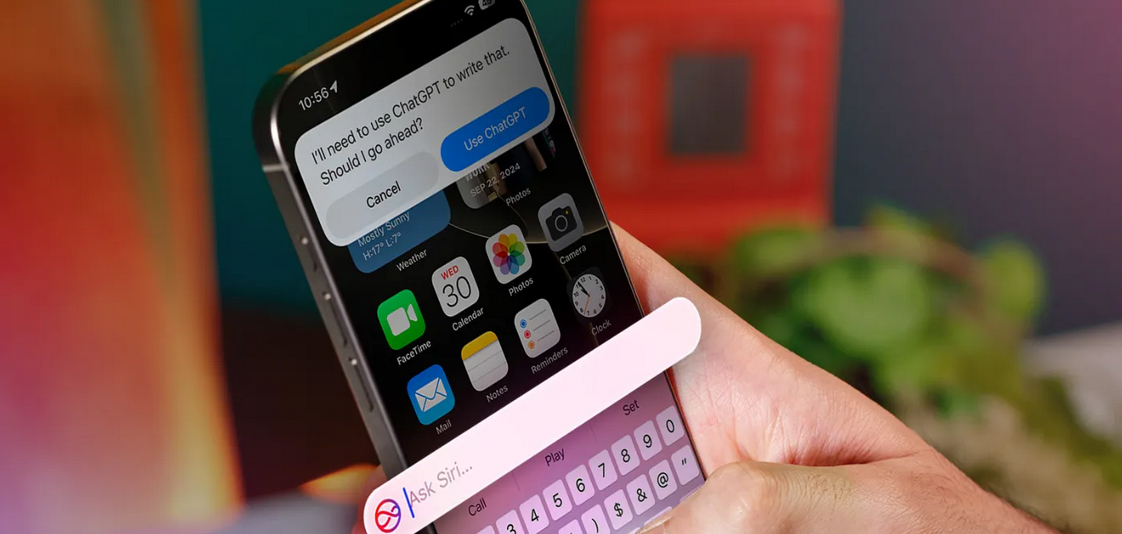
The integration of Siri with ChatGPT means that instead of relying on Google to answer complex requests, Siri will now rely on the popular OpenAI chatbot (of course, permission must be obtained first; however, for faster responses, this option can be disabled by unchecking “Confirm ChatGPT Requests” In the ChatGPT section of the settings, disable it).

The quality of the answers is what we expect from ChatGPT, and Apple even gives you the option to download this chatbot application in the Apple Intelligence & Siri section of the settings; But the good news is that using ChatGPT is free and there is no need to create an account. If you have a Pro account, you can log into the app, but if you don’t, OpenAI won’t be able to save your requests and use them to train its chatbot later.

Beta version of Apple Intelligence
Allow access to Siri ChatGPT
Request permission to ChatGPT
Problem processing Siri ChatGPT request
To use ChatGPT you probably need to change the IP

The real intelligence of Siri is where it determines what request to answer by itself, what request to ask Google, and what request to give to ChatGPT. For example, a question about the weather is answered by Siri, a question about the news of the day is usually left to Google, and if you have a request to produce text or image, Siri goes to ChatGPT; Of course, if you get bored and start your question with “Ask ChatGPT”, Siri will go straight to the chatbot.

Answer the weather question with Siri
Answer with Siri
Answers to questions about news with Google
Answer with Google
Text generation with ChatGPT integrated with Siri
Reply with ChatGPT

The new Siri has a good feeling and the color change of the keyboard and the color halo around the screen when interacting with Siri is eye-catching; More importantly, we no longer need to call Siri to ask her name, and by double-tapping the bottom of the screen, the keyboard will pop up and you can type your request to her (a feature that shy people like me appreciate). However, the use of chatbots, which are also the most famous, is not a new thing, and it is unlikely that Siri’s connection with ChatGPT will excite anyone, at least until this moment.

We have to wait until 2025 for the story to become exciting; When Apple promised that finally ” real Siri ” will make us unnecessary to deal with different applications.

visual intelligence; Only for iPhone 16

Apple Intelligence is only available for iPhone 15 Pro and later users and iPads and MacBooks equipped with M-series chips; But the access to the Visual Intelligence feature in the iOS 18.2 version is even more limited and will only be available to iPhone 16 series users; Because of the “Camera Control” button.

Visual Intelligence is a mouthful for a feature that is not Apple’s initiative and we experienced it a long time ago with Google Lens (of course, the Circle to Search feature of Samsung phones has a similar situation). By holding down the camera control button, the camera view will open. If you tap on the Search option on the right, the subject you see in the camera will be searched in the Google Images section to find similar ones on different websites. If you select the Ask option on the left side of the screen, ChatGPT will come into action and analyze the image for you.

Visual Intelligence feature
Visual Intelligence only for iPhone 16 series
Image search with Google in Visual Intelligence
Image search on Google
Image analysis with ChatGPT in Visual Intelligence
Image analysis with ChatGPT

The user interface of Visual Intelligence is minimal and eye-catching, and it shows both the subject search results in Google and the ChatGPT answer in a card on the recorded image. In addition, after submitting the image to ChatGPT, you can continue the discussion about the subject of the image with the chatbot integrated in Siri. The results are useful and practical in most cases (for example, when you are looking for the name of a certain plant), but remember that artificial intelligence is not always reliable. For example, when I took a photo of a notebook with an external hard drive design, ChatGPT mistakenly thought that what it was seeing was really an external hard drive and started explaining its specifications.

The images you take with Visual Intelligence are not recorded on the iPhone, and Apple assures that it will not have access to these images; But if you’re logged into your ChatGPT account, OpenAI is likely to store a copy of the image on its servers for analysis.

The only headache of visual intelligence is specific to Iranian users (of course, except that this feature is limited to new iPhones); While image search in Google does not need to change IP, to analyze it in ChatGPT, you will probably have to change your IP. Sometimes this change causes Google search to not work properly, and constantly switching between VPN on and off can be annoying.

And finally: the magic eraser for the iPhone

Apple was a latecomer on the AI ​​train, but the void for a tool to effortlessly remove distracting objects from an image was felt more than any other AI feature on the iPhone. I remember when Google first introduced Magic Eraser, I was quite surprised by its performance. iPhone’s Clean Up function, which has now been added to the Photos application, has exactly the same function, but it no longer has that sense of wonder, because it was released three years late.

A group of people walking in the Book Garden area
Main image
Samsung Object Eraser - crowd
iPhone eraser
iPhone Clean Up - crowd
Samsung Eraser
Camera and energy drink can together
Main image
Clean Up iPhone - camera and can
iPhone eraser
Samsung Object Easer - camera and can
Samsung Eraser

Of course, iPhone’s Clean Up tool works cleaner than Galaxy’s Object Eraser in most cases, and if what you want to erase is small, it’s hard to notice its blank spot in the photo. The Clean Up tool automatically detects disturbing objects and draws a line around them. All the processing is done on the phone itself and therefore, it does not take more than a few seconds.

But Clean Up does not have a new feature to offer, and probably most iPhone users who needed such a feature have been using the same Magic Eraser of Google Photos for a long time; Especially since they don’t need new iPhones and Apple Intelligence to use Magic Eraser.

Artificial intelligence writing tool

The iPhone artificial intelligence writing tool (Writing Tools), which is now available as a new option after Copy in the Safari environment and also next to the pen option in the Notes application, is exactly what we have experienced with Google, Microsoft, and ChatGPT products so far; Of course, with this limitation that it does not support the Persian language and therefore, it will not be widely used for Iranian users.

The tool itself consists of various options, including text correction, rewriting, friendly tone, professional tone, summary, summary, key points, listing, and table creation, the last four options in addition to the “Describe your change” bar, which gives users more freedom of action. For example, you can convert the text format to poetry), are still missing in the iOS 18.2 beta version; But it will probably be available with the release of the public version.

iPhone artificial intelligence writing tool
New Writing Tools option
iPhone artificial intelligence writing tool
Different Options of Writing Tools
iPhone artificial intelligence writing tool
Rewrite text rewriting capability
iPhone artificial intelligence writing tool
Many rewrites are full of emotional words
iPhone artificial intelligence writing tool
friendly tone
iPhone artificial intelligence writing tool
Professional tone
iPhone artificial intelligence writing tool
summarizing
iPhone artificial intelligence writing tool
The last 4 options have not been released yet

If you need to rewrite English texts, Writing Tools has a relatively satisfactory performance; However, Apple’s language model has a habit of using buzzwords and flashy descriptions like “eye-catching”, “unique” or “innovative”, even in summaries! And this issue clearly shows the traces of artificial intelligence in the text.

But the most important features of Writing Tools are the ones that are not yet available in the beta version of iOS 18.2, and I guess they will completely transform the note-taking experience in the Notes application.

Detailed features: from smart gallery search to the new Focus mode

Apple Intelligence is full of smaller features that may be less obvious than linking Siri with ChatGPT and Clean Up, but are likely to be important in simplifying a wide variety of tasks.

Read more: iPhone 16 Pro Review

Smart search in the gallery

Searching images in the gallery has become smarter and understands natural language. For users whose gallery is unorganized and searching among thousands of photos has always been considered an impossible mission, artificial intelligence is really helpful. The results are not always related to the search term, but at least one or two are close to what you are looking for. Interestingly, the new search also recognizes facial expressions such as frowning and smiling and can find specific moments in video clips.

Smart search man with camera in iPhone gallery
Man with camera
Smart search of frowning girl in iPhone gallery
The girl is frowning
Intelligent search of outdoor environment at night in iPhone gallery
Outdoor environment at night
Smart search of people walking in iPhone gallery
People walking

Intelligent Focus Mode

Apple introduced Focus modes to reduce distractions in iOS 15, and now a new mode has been added to the set of Apple Intelligence features; The Reduce Interruptions mode, which uses artificial intelligence, prioritizes notifications based on the degree of importance and displays only those that are really important from the point of view of artificial intelligence. It is possible to customize this mode like other Focus Modes and you can filter the apps and pages you want.

Reduce Interruptions focus mode on iPhone

Smart notifications

Speaking of notifications, let me add that Apple’s AI now categorizes notifications and displays a one-sentence summary of their content. Summary of notifications works both with the iPhone’s own apps such as iMessage, and with third-party apps. When you enable Apple Intelligence, the notification display automatically becomes smart, but you can turn off the notification display completely or just for a specific app by disabling Summarize Previews from the Notifications section in Settings.

Summary of articles in Safari

When you enter Reader mode to read an article in Safari (English articles, of course!), at the beginning of the article you will see an option called “Summarize”, by tapping on it you can read a summary of about 50 words of the entire content within a few seconds.

Apple Intelligence's Summarize feature
For the most part, abstracts of non-app articles have a more neutral tone

The summaries of the articles are useful in most cases. For example, when you open the Dragon Age: The Veilguard game review article, you just want to know whether a certain website has a positive or negative opinion about this game. The tendency of Apple’s artificial intelligence to use emotional words can be seen here, and for example, regarding the article about the launch of the M4 Mac minis, seeing adjectives such as “impressive” or “stunning” in the summary seems a bit excessive. However, Summarize seems to be a useful feature for people who are busy and whose English is relatively good.

The most exciting features… yet to come!

About six weeks have passed since the release of the iPhone 16, and Apple’s intelligence capabilities are not yet fully available; Including the Image Playground image generator that turns text commands into cartoon images, or the Image Wand in the Notes app that adds an image related to your writing, or the Genmoji feature that allows you to create custom emojis with a text description.

But in my opinion, what can really make the Apple Intelligence experience unique and “magical” is Siri; Of course, not in its current form, but what is going to be released in iOS 18.3 and 18.4. Apple is working on features like “screen awareness,” “user behavior analysis,” and “in-app actions” to bring its voice assistant closer to the dream it’s had in mind for years.

For example, thanks to the ability to be aware of the screen, you can tell Siri “Send this photo to so-and-so” and Siri will know exactly which photo you are talking about. Siri also has a better understanding of the content of emails and messages, and if you ask Siri to find a specific message for you or tell you when you took a certain photo, it can answer you. And more importantly, Siri’s control over applications will increase significantly and it will be able to do things that it couldn’t do until now.

Of course, we have to wait at least until 2025 for these features to be ready, and it is not clear that Siri’s performance will be exactly what Apple has promised many times. Until then, perhaps the most important challenge facing Apple’s voice assistant is to make users remember that there is such a thing as Siri at all.

Continue Reading

Popular